
This project was one for my 3D-Design course in school. We were challenged to pick a product and then design three different packages for it based off of three different age groups. The ages we had to consider were kids, young adults, and seniors. The product I chose was chap stick. I felt like this was a product that is widely used by all ages and each age looks for different components of the product.
Seniors
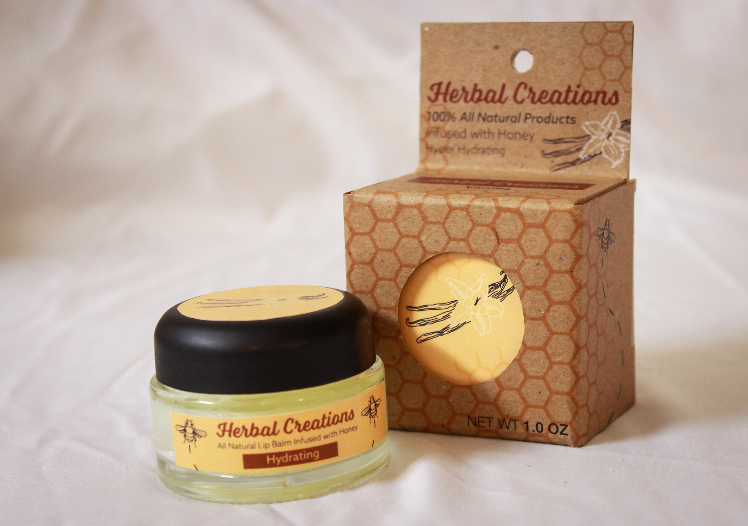
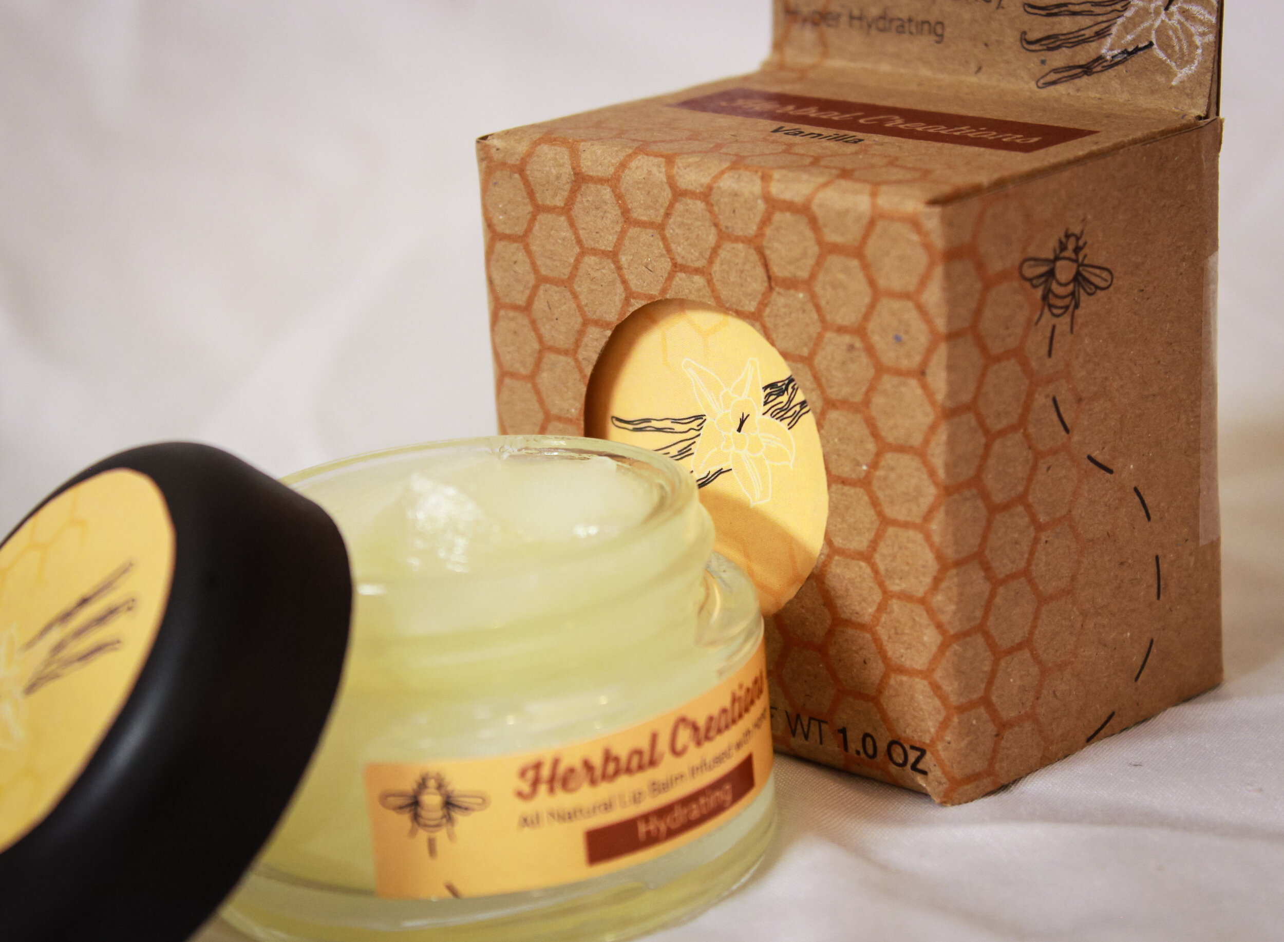
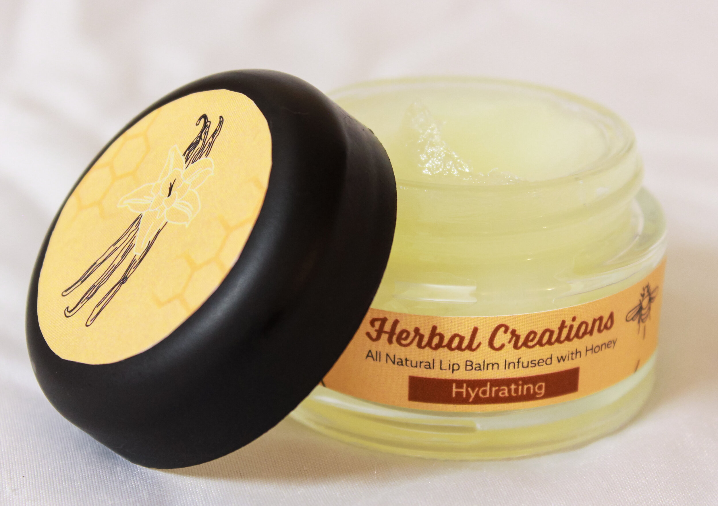
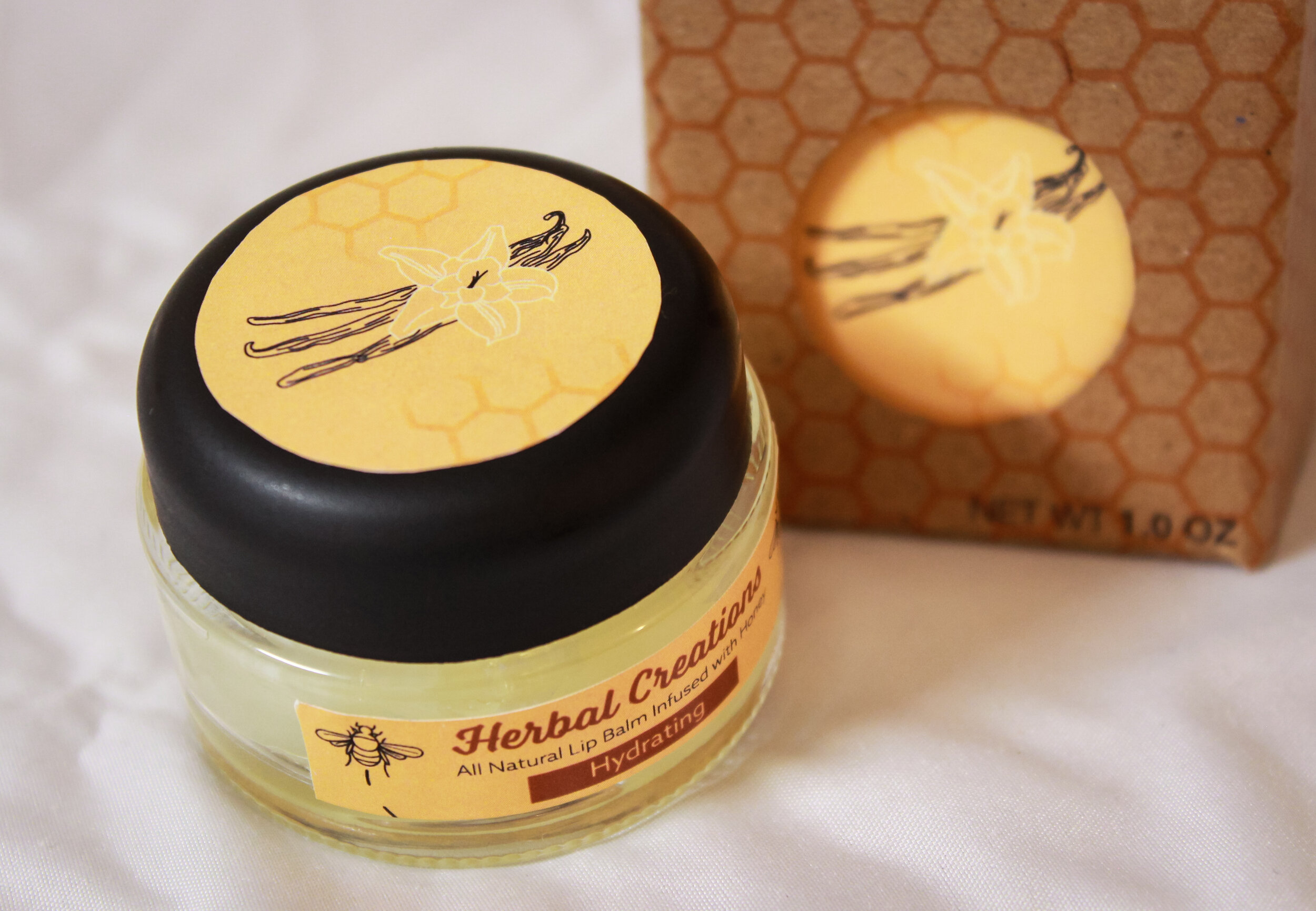
For the seniors’ age group, I decided to focus on displaying the all-natural benefits of the brand. This felt like appropriate advertising because seniors tend to be more concerned about health benefits than the other age groups. I also wanted to create the product focused around easy-to-open packaging. This meant that instead of the standard tube style chap stick is kept in, I opted for a container with a screw-on cap.
Young Adults
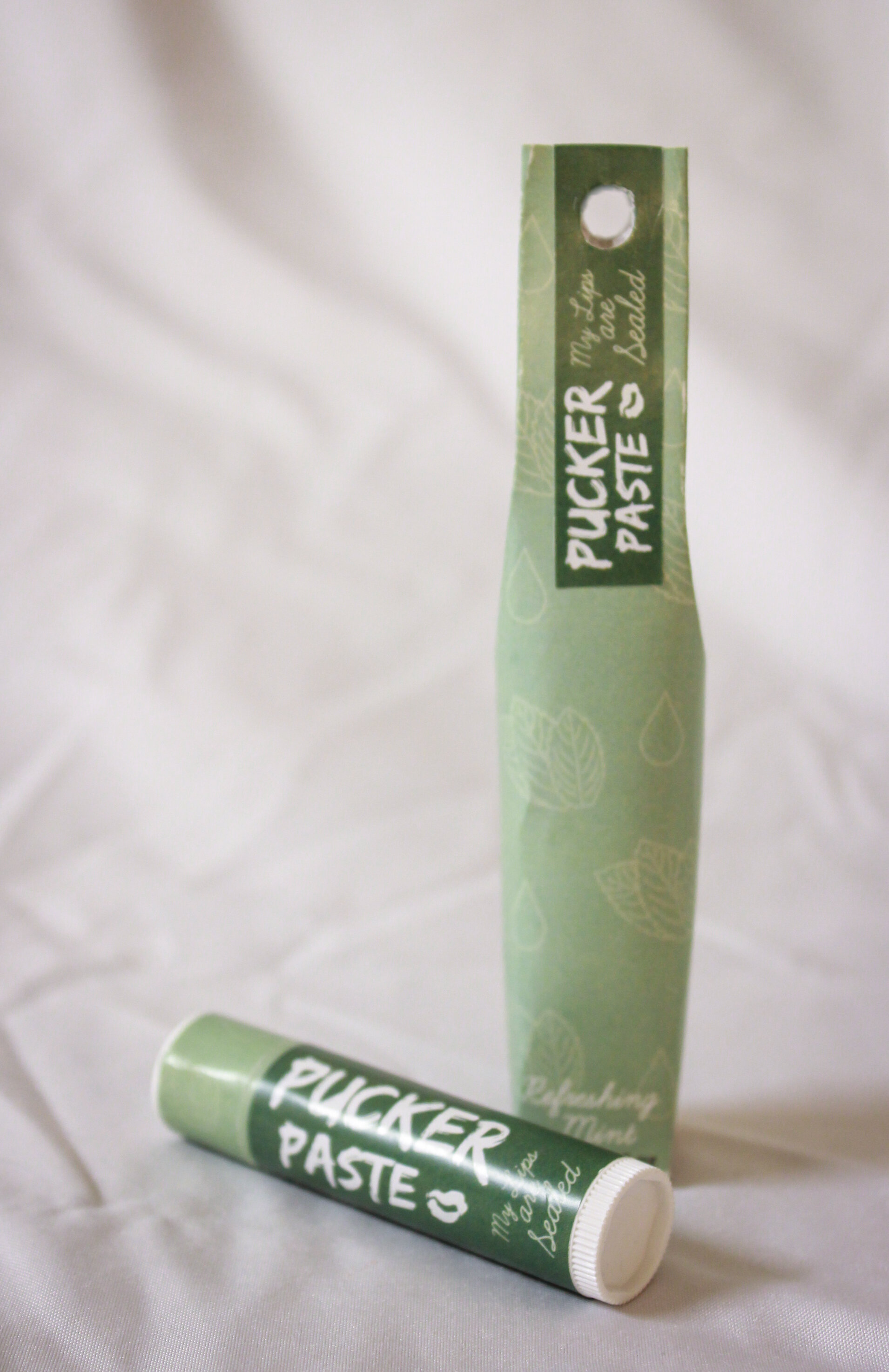
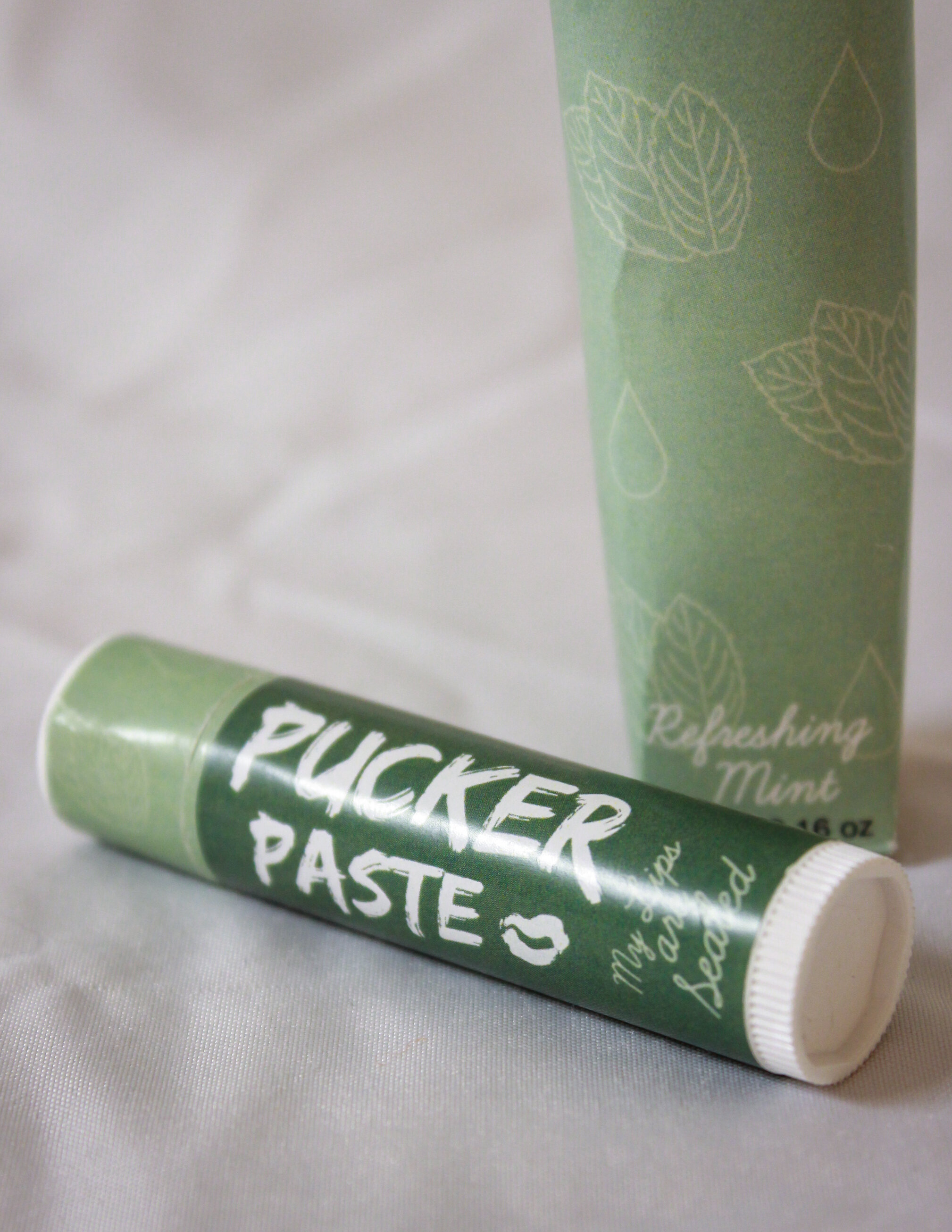
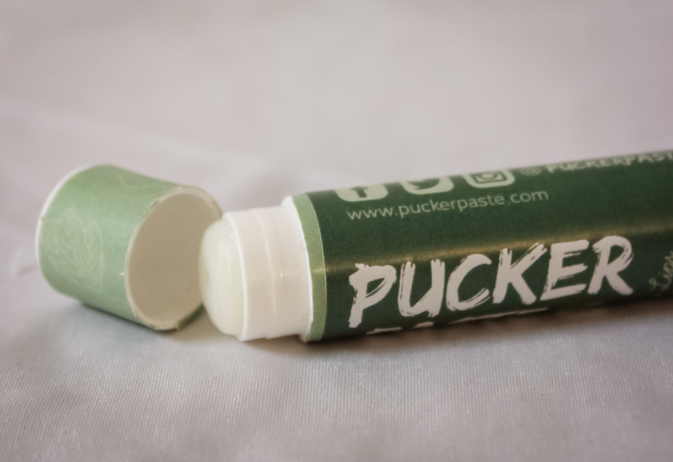
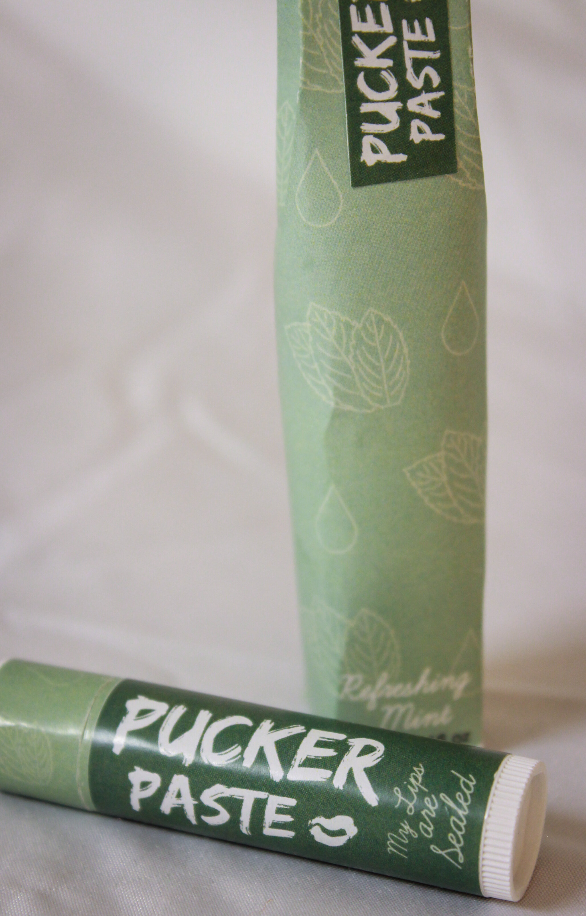
With the young adult group, I wanted to emphasis the brand of the chap stick. The brand needed to be fun and inviting. I really tried to play into the fact that young adults are dating and having fun with one another, hence the Pucker Paste name. I felt that this design would be able to easily translate into other flavors and appealed to the sleek form of packaging that many young adults like.
Children
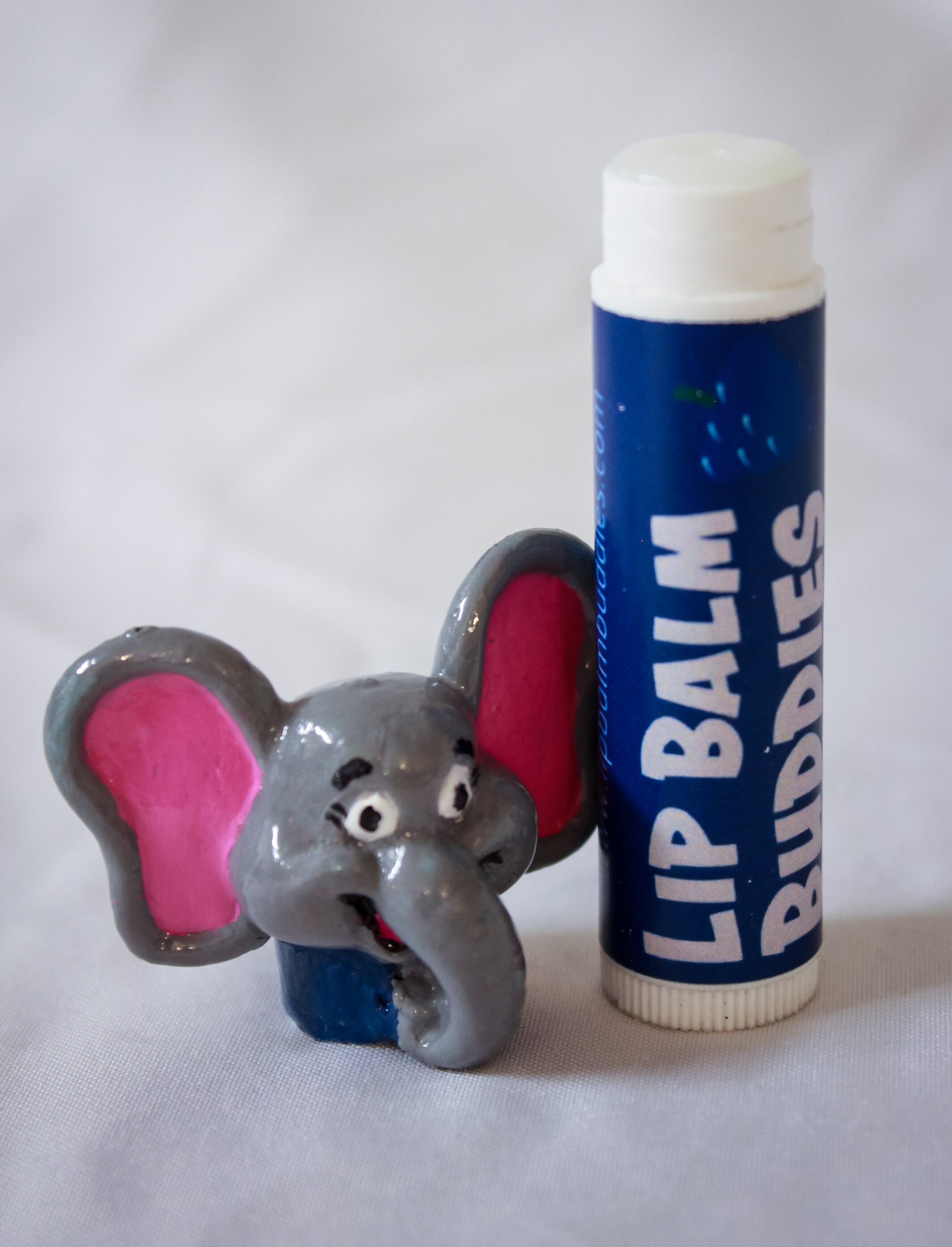
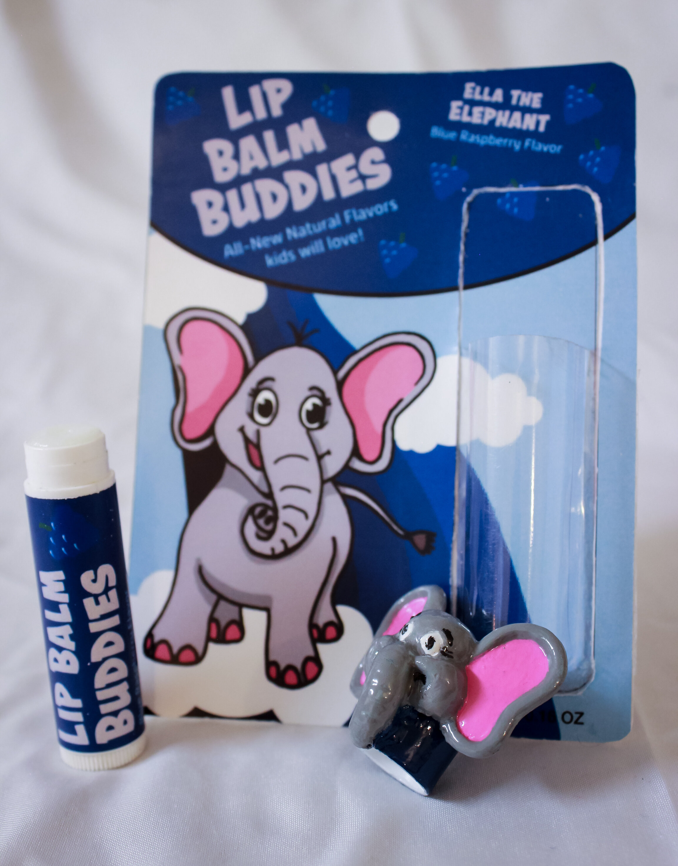
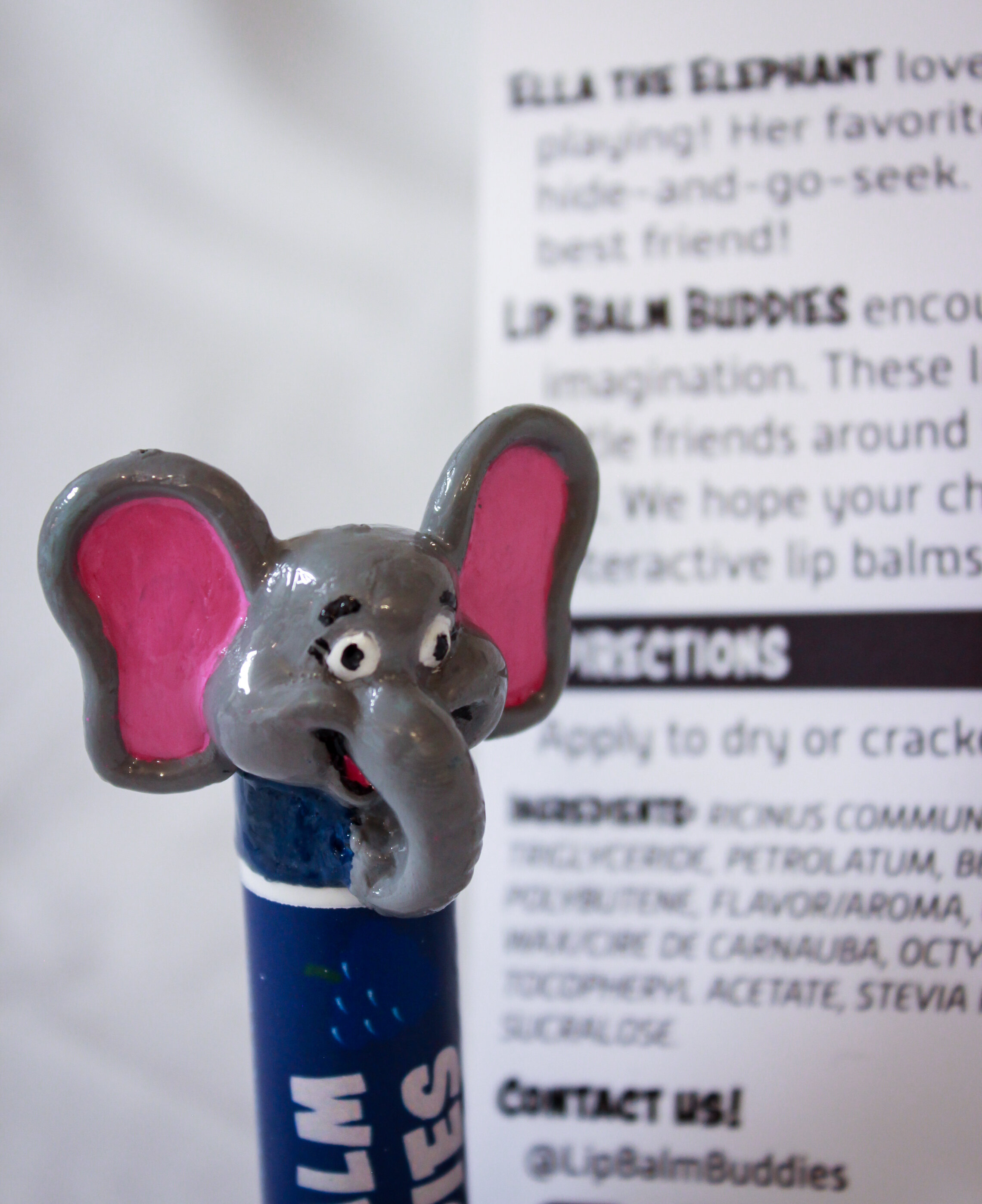
Finally, for the children's age group, I wanted the packaging to be fun. I felt like it would be appropriate if the packaging mimicked a toy that a child would play with. For this purpose, I decided to focus the packaging on friendly animals the child would be interested in playing with.
Overall, even though I don’t believe had the best execution on each of the products, I think the overall idea and conception worked well for this particular challenge. Improvements could definitely be made to the children’s packaging, but the other two I think had decent results. This project was a fun experiment in challenging myself to think about my audience and how important they are in the design process.