At Layton Construction there are a variety of projects that I am asked to work on depending on client needs. After winning a project with Aligned Energy, I was asked to design a challenge coin for the personnel working on that project. The idea was that they’d be able to remember the goals and motto’s set forth by our two companies for this project.
One of the main ideas of this project was “Being Vocally Self Critical Everyday” and “Intentionally Introspective.” My first idea was to include an image of the thinking man on the coin, representing introspection. After deciding that using the thinking man was to cliche, I then tried to use the image of a man looking in a mirror. This seemed to be too detailed and didn’t quite convey the motto in the way the team wanted. After many discussions and bouncing ideas back and forth, the team and I decided to turn one of the sides of the challenge coin into a mirror. This way, when the personnel looks at the challenge coin they will be reminded to have a moment to be vocally self-critical and intentionally introspective.
Since creating these initial challenge coins, I’ve been asked to create several other challenge coins for the various projects we’ve won with Aligned Energy. Some unfortunately never were minted because I designed them during the proposal process. The others are centered on themes for each of the projects such as Project Maguire or Project Valkyrie.
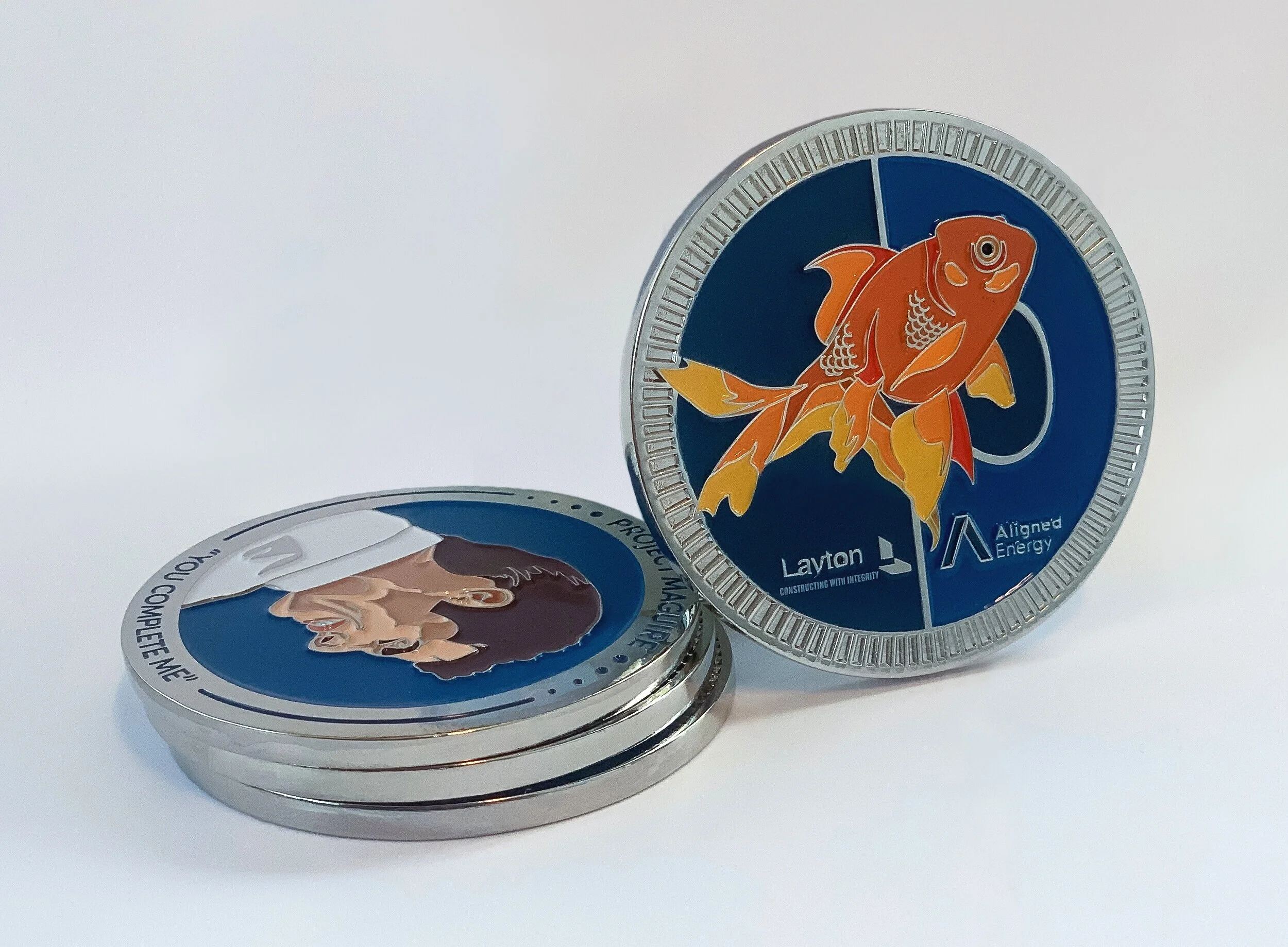
This set of challenge coins was created for a project Layton was working on with Aligned Energy. The specific project was titled “Project Maguire” after the movie Jerry Maguire. The group wanted the coin to be themed based on the movie. I had never seen the movie, so I watched it to gain ideas of what kinds of elements I could include in the design.
Not only was I supposed to include themes from the movie, but I also needed to show the unity between Layton Construction and Aligned Energy. With these two things, I came up with a couple of ideas to include those elements. Originally, I illustrated a different headshot of Jerry Maguire, but after further consideration, it was decided that the main headshot from the movie cover would be the most recognizable. I also wanted to include one of the lines from the movie on the coin. I experimented with “Show me the money”, but eventually ended up using “You complete me.” It better exemplified the unity between the two companies.
The actual design itself went through many different iterations. There were versions with football helmets, football fields, a football & a helmet, a puzzle piece, etc. Eventually, I decided to use the goldfish because it was a common theme throughout the movie. I also included the puzzle piece idea behind the goldfish to further promote the idea of unity. Overall, the client loved the design and I think it came out great as well.
Getting to the final piece you see here took a lot of time and innovative thinking. Originally I had been working on my project much like my classmates How-To Posters, in an organized visual list. After realizing how complicated this made my poster look and feel, I decided I needed to simplify my plan. I switched to using the "blown out" method instead of a list. Below you'll be able to see my beginning ideas of how I thought this project should work, which I later changed.
To get the images of clothing, suitcases, etc I photographed pictures of my own items and then drew over the photographs in Illustrator. To figure out the process of folding the clothes and the steps required, I photographed each step that I took while folding. This allowed me to see what steps were necessary to include and which ones I could simplify.
Another requirement for this project was that we create a digital interactive version of our project. You can view and interact with my digital version by using this link: https://marvelapp.com/8ae3439
This documentary title sequence was created for my Motion Design class. It allowed us to gain experience in professional motion design and creating a parallax video. It was created using Adobe Photoshop and AfterEffects.
I chose to create a title sequence for a documentary about Wisconsin because that’s where I’m from. I also feel as though not many people know much about Wisconsin, so it would be a plausible documentary. The most challenging part of this project was photoshopping the snowblower image into separate snow chunks so it could fit in the parallax. Overall, I enjoyed this project and the challenges that came with it.